
Adding Color: the point of no return
May 30, 2012


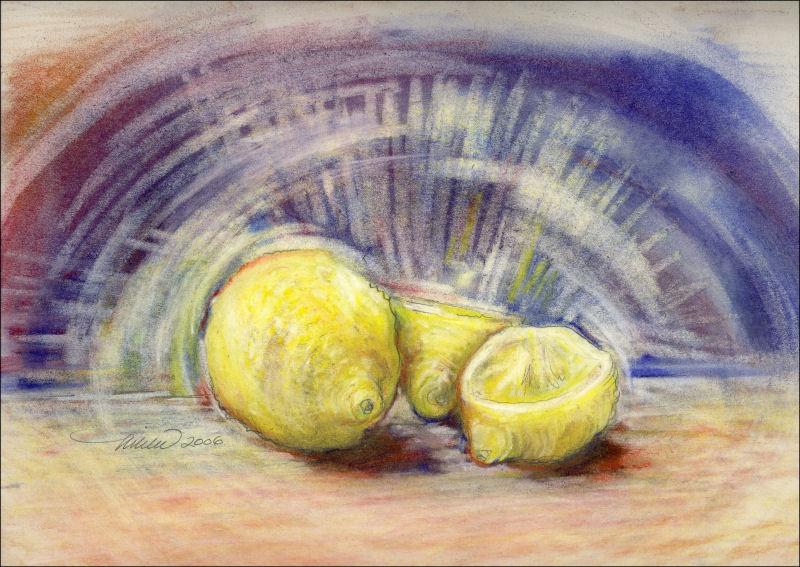
Chrysanthemums, work in progress; see previous post. Above: color details of 85W x 45L inches graphite, colored charcoal / dry pastels on white 100% cotton
When working with a large format, it’s easy to overwork the smaller areas. They’re like little compositions on their own. The trouble is, they may seem successful close up, but may not contribute to the overall balance and flow of the larger piece. Above are some examples, where I’m now reluctant to change what needs to be changed…but I will. Back to Art 101: It’s absolutely necessary to stand back often and study the entire composition from afar.
When you throw in a factor like color, there’s no turning back. I had a specific purpose for this drawing though; to fill a wall space in an otherwise fairly monotone, contemporary room. The idea was to create a look similar to a black and white photo where one color highlights the main subject only.
It’s obvious that introducing color has compromised some of the original spontaneity, so to recapture some of that energy, I carefully try not to disturb what’s left of those livelier marks, and enhance some with little sparks of color. Isolating red, and only red to the central main flower sapped all the attention, so I’ve added more colors to it and the surrounding elements than initially planned.
Categories: Abstract/Realism, charcoal, dry pastels, experimental, flowers, graphite, Seasonal, Spring, work in progress | Comments Off on Adding Color: the point of no return
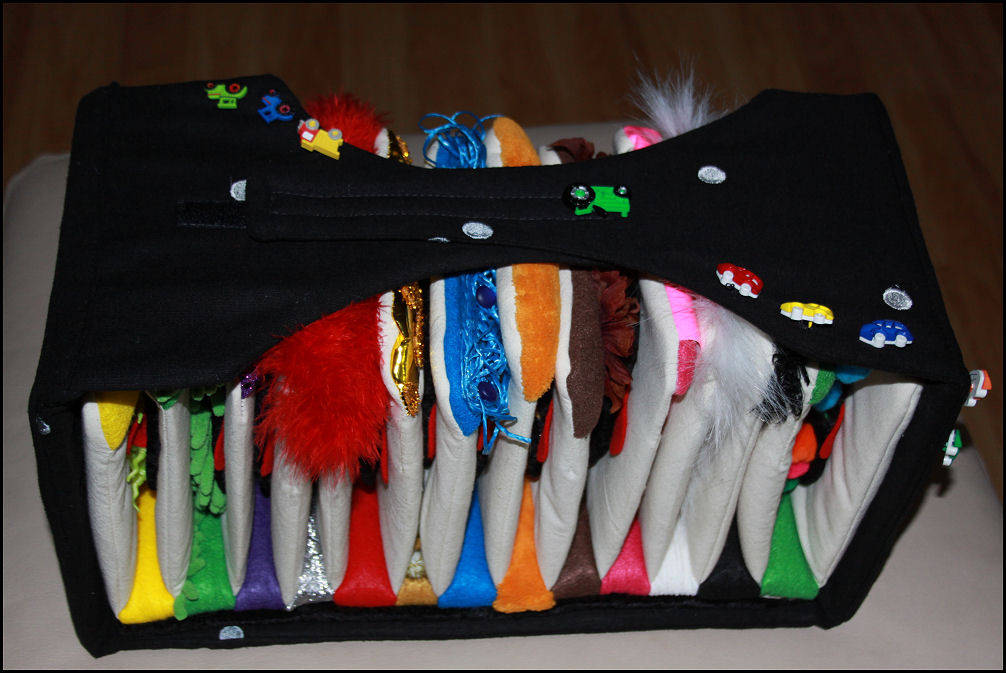
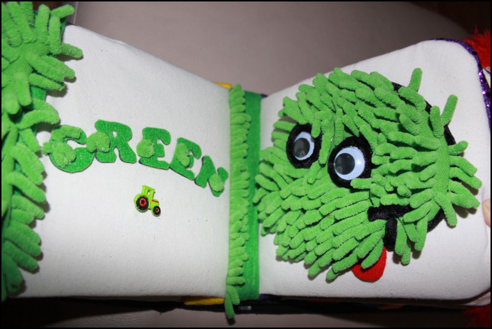
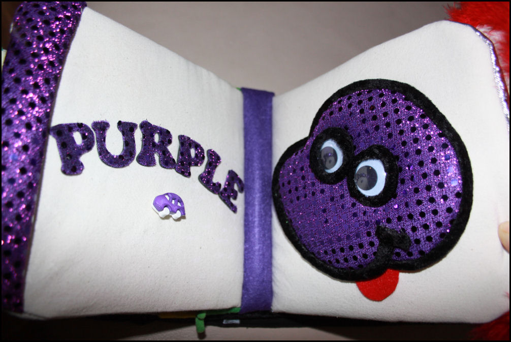
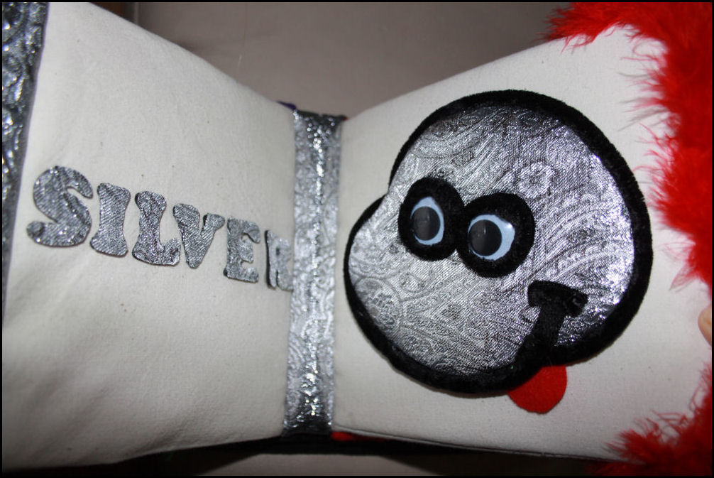
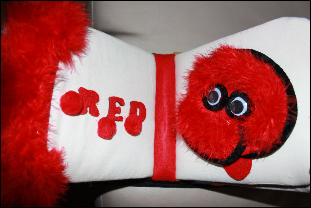
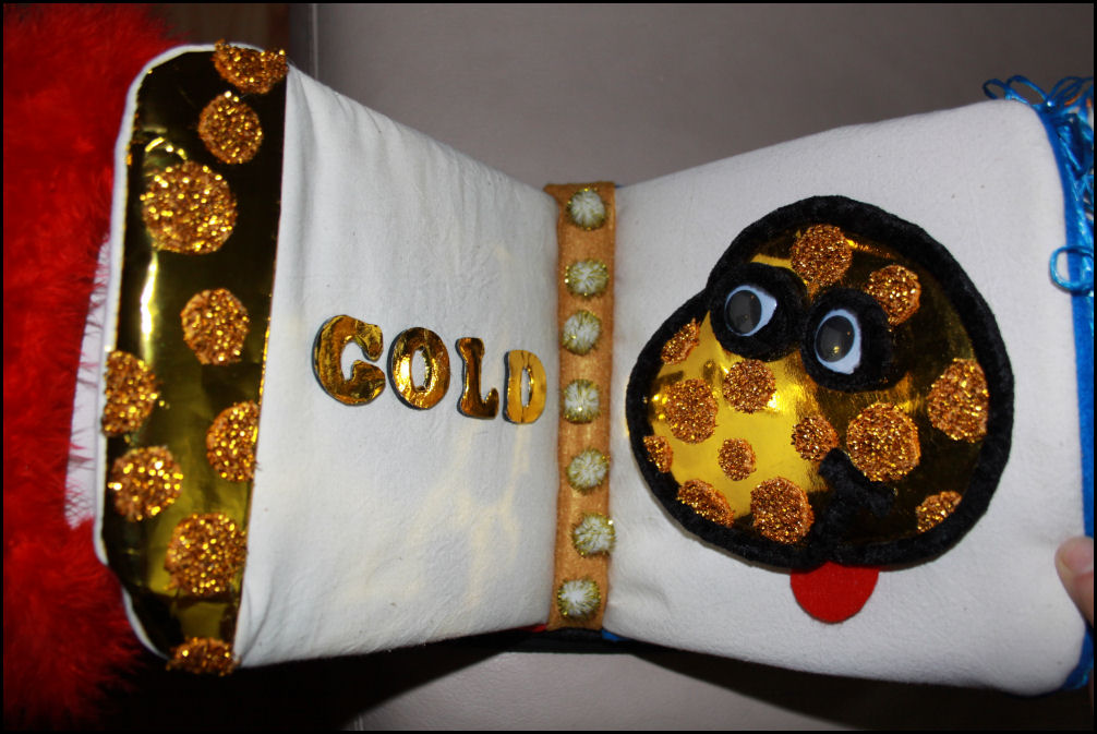
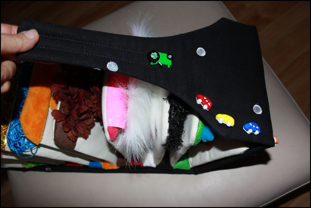
Colours For Cameron, first book for my grandson
May 25, 2012
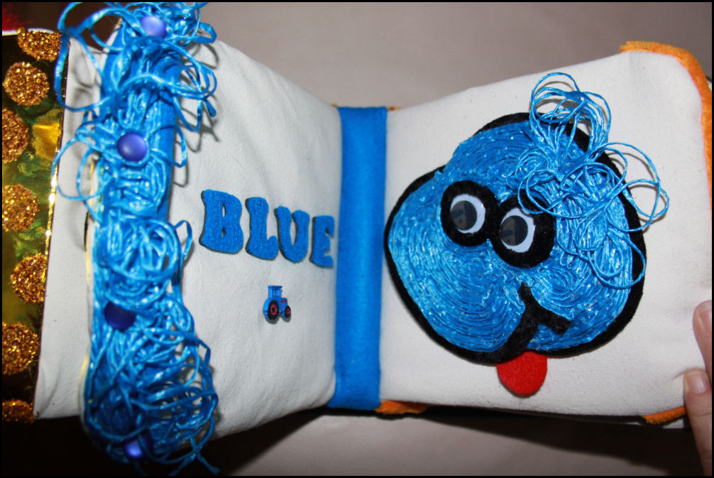
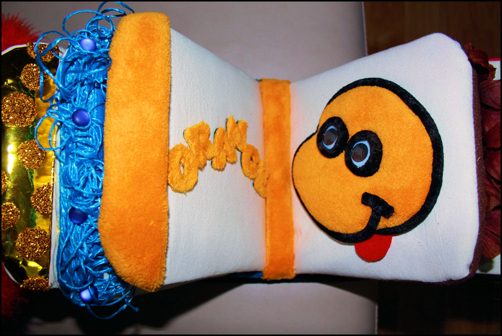
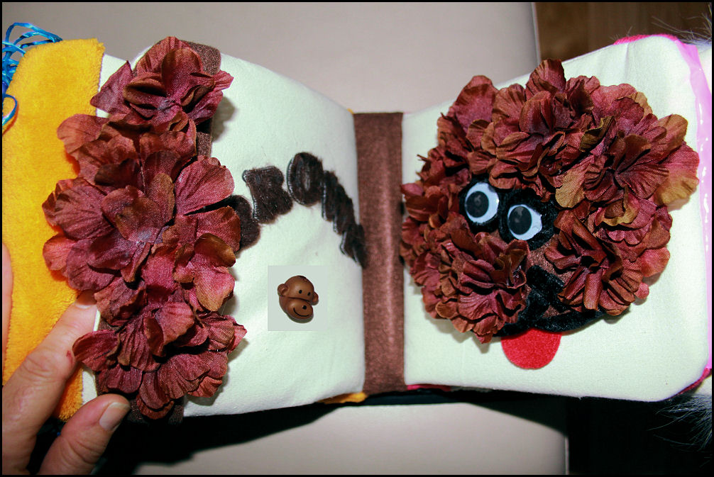
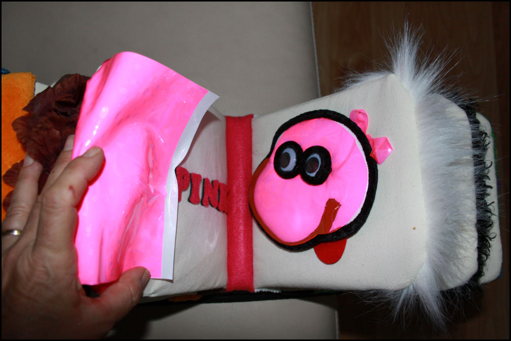
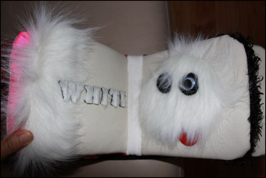
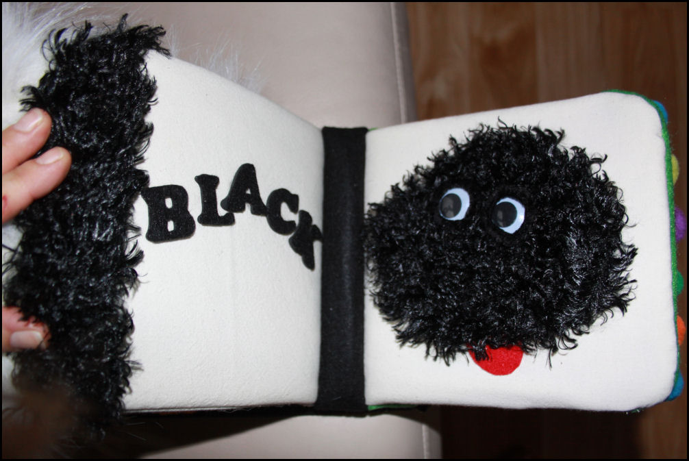
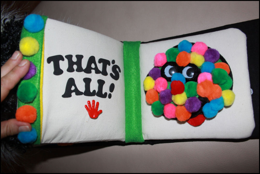
 2012: Colors For Cameron
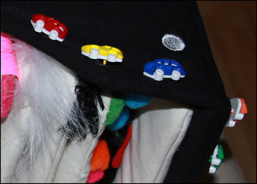
When my grandson was born in 2011, I had already decided to make him a book every year for his birthday. One-year-olds are receptive to colors and textures, so a soft book for Cameron at this age was perfect. Using Monte as my muse, the work evolved into a sort of stuffed toy-book hybrid that is much bigger than was initially planned, but it’s quirky, fun to read, and Cameron likes it. Each 6 x 6 inch page is quilted unbleached cotton sewn over heavy cardboard from a disassembled book purchased at the dollar store. I bought a lot of the things there actually, like many of the textured materials, including a dog toy with the squeaker removed and incorporated into the last page. The savings were spent on tractor buttons and more costly embellishments I knew he would like.
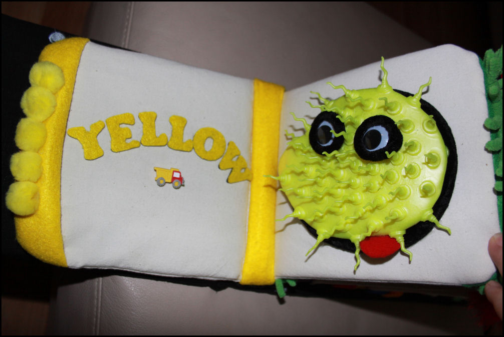 Each page has quilted appliques of Monte in different colors, with big googly eyes. The outer edges of each page have shallow pockets to grab the page, covered whatever textile corresponds to each Monte. The ten or so chubby pages are sewn together – 2 inches of fabric were left on the book’s spine-side for that purpose. The combination was then attached to a sturdy cardboard spine with a glue gun. No turning back after that, because hot glue is permanent on fabric. The entire cover of black linen wraps around with straps that Velcro together, creating a handle. Little button-vehicles adorn the handle area – he loves tractors and cars. I’m happy with the finished piece, and so is Cameron. It’s one of a kind, like him.
Categories: Books, children, design, mixed media, series, Smile | No Comments »
Chrysanthemums: work in progress
May 18, 2012

Chrysanthemums, 45L x 85W x 3D inches, graphite, charcoal and primer on 100% cotton, work in progress
 Rather than priming the fabric first as usual, water and primer are painted to enhance the graphite while the composition works itself out. It’s been all about getting lost in the improvisation and surprise! Grass blades are implied by the buildup of thin streaks throughout, which also serve to balance and energize the work, plus add slight cubist effects.
This is will hang in a contemporary-style room. If color is used at all it will be limited to red, yellow and green areas near the large main flower. Parts of the surface may be left raw, so to set the finished piece, the entire back will be primed and the front will be sprayed with fixative.
~
The chaos of this past year, moving to Oregon from Texas, has truly put my artsy artist’s statement to the test; that ‘creativity is an attitude toward life’. I’m accustomed to creating chaos in my artwork, then resolving it. With too many move-related priorities and unfinished renovations, no wonder I’ve felt increasingly disoriented. The good thing is that observations never stop, even if the focus on art-work has to.


Categories: abstract, charcoal, design, drawings, experimental, flowers, graphite, Seasonal, Spring, work in progress | Comments Off on Chrysanthemums: work in progress
Dr. Ip
November 25, 2011

The move west, and renovating homes around that, has unfortunately thrown my career on the back burner. Hence the home improvement tip brought to you by Dr. Ip, another new character based on good ol’ Monte, who has evolved since 1974 and still plays a part in my expressions today. He’s getting a good work-out these days!
Categories: cartoon, digital manipulation, inspiration, interiors, Smile, The Monte Files | No Comments »
The secret life of wall paint
November 23, 2011

 I have a whole new respect for all trades-people! All I’ve had time and inclination for art-wise are a few little cartoons using my laptop now and then. I’m going a little nutty with all the wall painting here in Ottawa (Canada), renovating a townhouse to get it ready to rent. With no TV in the evenings I’m having some fun with the secrets revealed to me as I work. Monte is optimistic….
Categories: cartoon, digital manipulation, inspiration, Smile, The Monte Files | No Comments »
True colors
May 26, 2011

Tree fern shadows cast across garden rocks in Chapala, Mexico
“Your true colors are beautiful” – Cindy Lauper
I’ve been in Mexico for the past two weeks, so I’ll be contributing more images to the True Colors website, created in 2007 as tribute to the colorful landscapes and cultures here. Developed separately from the other chapters of nikkiartwork.com, trucolors.info is considered as one complete and independent project. I’ve posted a few more of the recent pieces in this series on nikkiphotography.com
Categories: Chapters of Nikkiartwork, flowers, flowers and leaves, fruit, garden, landscapes, leaves, Mexico, Nikki website, photographic series, photography, rocks, Seasonal, travel, trees, True Colors series | No Comments »
Monte rocks!
May 10, 2011

Categories: design, drawings, fantasy, inspiration, mixed media, rocks, series, Smile, The Monte Files | No Comments »
Stepping Stones
March 25, 2011
 1.
1. 2.
2.
 3.
3. 4.
4.
While I was in Portland two weeks ago, starting the Texas-Oregon relocation process, I completed five new Zen Gardens, filling a request for one. All five are smaller, slightly different versions of ones made previously. Four are shown in thumbnail images below.
The very first Zen Garden was created in 2000 as part of a four-painting commission. The ideas established in that set foreshadowed new routes to trying methods I hadn’t before, like enhancing my paintings with 3D elements. That set is also the origins of the “box frame” design that I’ve used on several other paintings since then, where each main canvas is mounted on a wood platform, framing the work with about four inches of extra play-space.
Whereas some frames have the effect of abruptly ending a composition, this type of frame enables space for the subject to continue, softens the edges and adds an interesting twist to the overall impression. When items related to the main subject are placed in that area it adds dimension, not just in the physical sense, but also in the conveying of any abstract or symbolic stories beyond the presentation of the main painting inside.
Because of the challenges acheived in those paintings, 1) a series was born that I’ll continue with for the rest of my days. In  2) Prickly Pear Cactus, pins were applied around the main central frame, then painted. The smaller canvas done during 2005 (left) borrowed this technique, and the same principle of attaching things to the main frame can be used with any number of objects.
In 3) Alpine Meadows, I learned to use all the qualities acrylic paints offer by watering down the consistency for the distant mountains, then sculpted the flowers and grasses with a palette knife on the lower portion. Finally, the theme of 4), The Evolution of Communication has intrigued me ever since, but I still haven’t fully pursued the possibilities. This is the perfect means to learn about Art History hands-on by attempting to recreate it in some form, then to share that adventure and ideally, inspire interest in the topic at the same time. Two old keyboards have been collecting dust in my studio closet for a number of years, yet to be disassembled and incorporated into a new series of work with similar associations.
~
Some of our peers advocate that if we don’t concentrate our efforts to learn one medium well, we will never excel in any. They are right of course, in many respects, but scores of artists are not content with singing just one note. Some simply cannot. To be fair, what works for one does not work for another. Each of the above paintings are examples where a combination of skills and different media in one piece can be very effective. I’m here to say that integration is possible! It’s a longer, meandering road..but it is possible.
 There are so many different paths artists can take, long and short term; opportunities every day. There are endless kinds of subjects, ready-made and unconventional materials, always something to start or finish, new methods to explore, and an overabundance of ideas to attempt in one lifetime. Self discipline is the order of every day, either to start working or know when to stop.
My philosophy is that doing something, unless naturally in need of rest, is better than doing nothing. However, being overly ambitious in too many areas is also how I, along with millions of other artists end up with a variety of different kinds of art (or just stuff!), and the arguements endorsing one type of study come into play. Should we restrain ourselves when it comes to making “stuff”? Why is consistency given more support than variety when it comes to showing and selling art?
Whatever choices we make; whichever direction we take depends mostly on the intention for the finished products. Who is it for, do you want it to sell it, where, how, and how quickly? Was work done as a personally cathartic process, as a lot of art is? …or is it just a thing with no emotional attachments or brainy messages? Artists who support themselves by offering a range of services, satisfied and busy enough by word-of-mouth sales, do well jumping from medium to medium. If the hope is selling work through galleries and art dealers though, what some call “too many voices” are apt to be a disadvantage. 
In one of his recent articles, Robert Genn writes sensitively about multi-media artists. While he supports that “for artists, exploration is like oxygen” and that “the nature of our game is to be distracted by our muse”, he also recommends that artists must present consistency in our approach if gallery exhibition/sales is what we pursue.
When a gallery represents an artist, they expect an overall consistent look and a clear statement. Where venues sell a number of artists’ work, the ambiance cannot be one that resembles a yard sale. If potential buyers view too many styles, subjects or media in one place or by one artist, they tend to lose interest, resort to window shopping, and walk away empty-handed.
 I can relate to that: the effect is like standing in the toothpaste isle at the pharmacy, where the senses are bombarded with colorful packaging, alluring titles and fine-print promises. Assuming beforehand that the choice would not be anything but simple, there have been times when I’ve said ‘forget it’ and gone back another day. With art sales though, you don’t want buyers to come back another day, because it may not be your art they choose then.
Gallery owners and dealers do not do us any favor if they display too much variety in typically limited spaces, so Mr. Genn has an excellent suggestion: bring art done in different medias to different galleries.
He also says to keep working no matter what.
Artists have a strong sense of mission. Periodically it needs reevaluation, and with that bigger picture clear, we create the way as it unfolds before us. If we are serious about selling, we first need to become familiar with what we are best at, what we love, what works and what doesn’t. We need experience in order to learn – that takes time – and there’s no getting around it. Experimentation is fundamental to this profession, but if it’s intended to be sold to others and by others, simplifying the look and clarifying the purpose of our art is crucial.
 A viewer at one of my exhibitions commented, “You’re all over the place, arentcha?!” As disturbing as that was, it’s true and I needed to hear it, eventually concluding that I do need to clean up my act, but at the same time this is how I work. This is how my stuff works. Every so often there are paintings or a series of works that encompass all that’s been learned and all that I’m capable of; breakthroughs that define a solid new direction or validate the existing one. The commissioned set of paintings described above were like that, and their significance is still an influence on today’s work and will be on tomorrows’ too. They verified that I’m on the right path even though much of the time is spent off of it, experimenting. I call it serious play and paying attention… “playing attention”! Once in a while the bits and pieces come together in one big rewarding “Eureka!”.
Categories: 3D, acrylic painting, design, experimental, innovation, inspiration, landscapes, older work, rocks, series, Zen Garden series | 1 Comment »
Art and Adaptation
February 12, 2011
Adapt “1a: to make suitable or fit (as for a particular use, purpose, or situation) 2: to adjust oneself to particular conditions or ways: bring oneself or especially one’s acts, behaviour, or mental state into harmony with changed conditions or environment.”
Art “1b(1): skill in the adaptation of things in the natural world to the uses of human life … 2d: systematic application of knowledge or skill in effecting a desired result … and to production according to aesthetic principles…” (Webster’s Third New International Dictionary).
 Art is all about adaptation – of materials to circumstances, to changes in initial plans and set expectations, and staying open to the serendipity of the inevitable unknown in order to recognize opportunities when they unfold as mistakes. A painting goes through alternating stages of chaos and resolve, of full-on confident energy intermittent with periods of reservation and study. One never knows when the process will be finished, and sometimes great efforts result in nothing great to show.
Adapting to life changes is very much like painting. The materials are different, but seeing it that way, moving personal and professional life to another part of the world does not seem so disruptive. That “life imitates art and art imitates life” never quite made sense to me until now. It’s about seeing the picture as a whole while manipulating sections of it, without getting so involved in the details that, ironically, the focus is lost.
All the travel last year was rejuvenating. By the time Fall arrived I was good and ready to apply those experiences to some dedicated painting when, during September my husband accepted a job in Oregon. As folks who know us know, he moved there in October while I stayed behind. With all this attention to house-duty, I’ve been feeling anxious about not being able to maintain all my career commitments during this transition. After not posting any new art on this blog for about six weeks, it’s important to my reputation as a professional that clients and associates (past, present and future) know that I have not stopped working; only have briefly been working on something else.
 I’m looking forward to the drive from Texas to Oregon; one phase completed and another beginning. Regardless of location, ideas and inspirations are infinite, always available and uninterrupted in the grand scheme of things. Best of all, these things are portable! You can take the girl away from the art, but you can’t take the art away from the girl!
Saying that change is good sounds cliche, but here’s how I think it works: change pushes us into discomfort, which in turn pushes us to seek innovative ways out in order to regain comfort. In that sense, discomfort is motivating and progressive. Now that I think of it, too much comfort can be uncomfortable! When one set of dilemmas is resolved we instinctually go searching for more. Life and Art are a soul’s song and dance.
Above: Basil roots and stems garden sculpture entitled “Song and Dance”
Categories: design, garden, inspiration, interiors, travel | 2 Comments »
Five seconds of beauty
February 10, 2011

There are days when a falling leaf is just a falling leaf, but today one caught my eye as it floated down then caught an updraft, then flipping sideways and rolling over a few times, it seemed to be avoiding its final destination as long as it could. It was five seconds of beauty I will never forget!
I’m sure my friend and mentor, Jo Williams will not mind me passing along her note of a quote by Judith Hanson Lasater: “As many times a day as you can, find something to be grateful for because that will connect you with yourself, with others, and with the wider world. And we need to do this MOST when things are their most difficult in our lives. ”
 Maybe the leaves have fallen like that all season, but I was too busy grumbling about raking half of them from our neighbour’s yard. I’ve been too busy detailing the house inside and out, trying to get it listed as soon as possible. There have been issues this winter of solid ice in the eves-troughs, and having to chip away and melt trails with boiling water so the roof run-off would flow properly. I was too annoyed to notice the incredible phenomena on the other side of the house that were created by the very same problem.
Left and above: alien-like forms were created when slow-melting ice dripped from the eaves-troughs onto shaded Dogwood branches.
 Before the snow and frigid temperatures last week, the pansies were finally filling in and gorgeous alongside the back yard fence. When winter came with a vengeance and would not let go, so did my view that, “Aww, the pansies are frozen!”, but yesterday,it changed to: “Awe! The pansies are frozen!”
Thanks for sharing, Jo!
Categories: elements, flowers, garden, inspiration, Other Artists, photography, Seasonal, Texas, trees, Winter | 2 Comments »