
flowers
« Previous Entries Next Entries »Spring Garden Mix
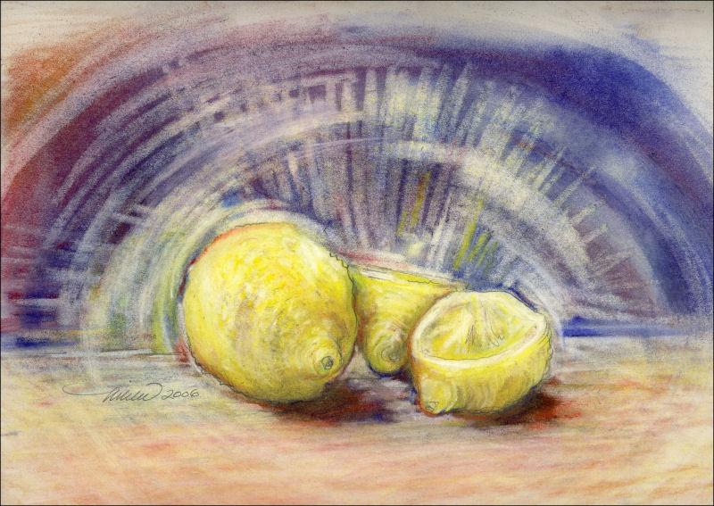
Saturday, April 27th, 2013

Spring Garden Mix, 18H x 24 inches oil pastels on 80 lb acid free premium. Framed size 27H x 33 inches.
BlossoMania
Thursday, April 25th, 2013

Blossomania, 12H x 16W inches oil pastels painted with oil blending and glazing medium on 80 lb acid free premium, white mat
I’ve been admiring the round masses clumped on the Plum tree branches in our neighbor’s back yard for a week or so now. Yesterday and today, pink swirls in the wind inspired this kooky poem
 Petals are falling, the sky is blue
They cover everything, old and new
If I sit too long, I’ll be covered too!
Larger image shows the finished piece, 12H x 16W inches, which was cropped from the original size, left thumbnail, 18H x 24 inches. Blogging always reveals a different perspective. If I had not re-sized the original in order to post, I might never have recognized that the cropped portion has a more balanced composition…benefits of blogging!
Celosia – work in progress
Thursday, April 18th, 2013

Celosia, work still in progress, 18H x 24W inches 0il pastels on 100% cotton paper
This piece was tucked away a month ago, planning to continue work in future with new eyes, so with nothing to lose, I jumped back in today and threw more color around. I splurged today and bought about 40 new oil sticks, the “Sennelier” brand. Wow, they are so intensely colorful and creamy-beautiful to work with! There is no contest as far as quality compared to any of the other brands I’ve been using, but they do have a lot of oil content which makes them muddy easily. Looks like it needs to be stored away again to re-work and refineanother day. I don’t like giving up on a piece until it feels absolutely done, or without a doubt done to death!

Left, March 22nd, 2013, Day 4 in progress
Reminiscent of retro sofa fabric, now that I see it on-screen! Usually leaving page space showing through to create light and brightness, this time I colored the entire page yellow before starting. Adding white did not help brighten areas much, but did muddle colors, helping some flowers recede. Much of the pure color as seen in the early versions has been covered up or removed, but will be re-added cautiously. The style has also gradually changed to more of a Representational/Impressionistic one. To finish, there will be more scrutiny, and fewer emotional responses before adding or removing anything else.


March 20th through 22nd; Days 1, 2, and 3
Zinnias
Thursday, December 20th, 2012

Zinnias, 18H x 24W inches graphite on paper.
Using an eraser just as much as the graphite, the composition is roughed in to fill the page. Smudging creates dark tones – some are removed with different sized erasers, and some areas are detailed. Initial plans were to create a drawing with about 4 inches of grey tones bleeding into a colorful central square to be drawn and painted with watercolor pencils, similar to Chrysanthemums, with borders more defined, but I like this one without colors. Plans always need to change according to what the results are dictating.
Flamboyant Tree flowers and seed pods
Thursday, December 6th, 2012

Flamboyant Tree Flowers and Seed Pods – Chapala, Mexico – 9H x 12W inches oil pastels on paper, white mat
Fields of Flax – Rowley, Alberta Canada
Monday, November 12th, 2012

Fields of Flax, Rowley, Alberta Canada, 12H x 16W inches watercolors on paperpreliminary study for larger acrylics painting
Missing routine
Thursday, October 11th, 2012
 The Campsite, 24 x 30 inches watercolors on 140 lb cold pressed premium
I finally brought my watercolor paints back from my son’s place in Canada, where I left them so they wouldn’t freeze on the 5-day drive back west last November. Driving again, I’ve just returned from this year’s visit, when I gave my grandson a one-of-a-kind fabric book hand-made for his first birthday, Colors for Cameron. I plan to make him something special every year.
So, with a couple of new brushes and 12 x 16″ paper block, and now with the rainy season upon us back in Oregon, I look forward to establishing a routine of painting again. Invigorated by a summer full of gardening and flowers, the stunning scenery across America this time of year, plus reviewing archives of work I haven’t seen for ages, I’m all set to splash out some new watercolors. Our Portland house is a renovator’s dream/nightmare!, and we’re not out of the woods yet. Attempting to focus more on art than house, smaller paintings are more manageable and less of a production than my typically large canvas paintings…however, I’m curious to experiment and see how watercolors behave on primed canvas at some point!
Chrysanthemums
Tuesday, June 26th, 2012

Chrysanthemums, 85W x 45H 3D inches graphite, charcoal, soft pastels, fixative with primer used as paint on white 100% cotton. Grey narrow frame. This is a beautiful painting, impressive because of its size and the expressionistic style of the flowers. The small photo doesn’t do it justice, so some detail images are provided below. It’s hanging in our family room on a grey wall beside the Chrysanthemums Chair. They do look great together!
| Detail images: |  |
 |
 |
||
 |
 |
 |
Adding Color: the point of no return
Wednesday, May 30th, 2012


Chrysanthemums, work in progress; see previous post. Above: color details of 85W x 45L inches graphite, colored charcoal / dry pastels on white 100% cotton
When working with a large format, it’s easy to overwork the smaller areas. They’re like little compositions on their own. The trouble is, they may seem successful close up, but may not contribute to the overall balance and flow of the larger piece. Above are some examples, where I’m now reluctant to change what needs to be changed…but I will. Back to Art 101: It’s absolutely necessary to stand back often and study the entire composition from afar.
When you throw in a factor like color, there’s no turning back. I had a specific purpose for this drawing though; to fill a wall space in an otherwise fairly monotone, contemporary room. The idea was to create a look similar to a black and white photo where one color highlights the main subject only.
It’s obvious that introducing color has compromised some of the original spontaneity, so to recapture some of that energy, I carefully try not to disturb what’s left of those livelier marks, and enhance some with little sparks of color. Isolating red, and only red to the central main flower sapped all the attention, so I’ve added more colors to it and the surrounding elements than initially planned.
Chrysanthemums: work in progress
Friday, May 18th, 2012

Chrysanthemums, 45L x 85W x 3D inches, graphite, charcoal and primer on 100% cotton, work in progress
 Rather than priming the fabric first as usual, water and primer are painted to enhance the graphite while the composition works itself out. It’s been all about getting lost in the improvisation and surprise! Grass blades are implied by the buildup of thin streaks throughout, which also serve to balance and energize the work, plus add slight cubist effects.
This is will hang in a contemporary-style room. If color is used at all it will be limited to red, yellow and green areas near the large main flower. Parts of the surface may be left raw, so to set the finished piece, the entire back will be primed and the front will be sprayed with fixative.
~
The chaos of this past year, moving to Oregon from Texas, has truly put my artsy artist’s statement to the test; that ‘creativity is an attitude toward life’. I’m accustomed to creating chaos in my artwork, then resolving it. With too many move-related priorities and unfinished renovations, no wonder I’ve felt increasingly disoriented. The good thing is that observations never stop, even if the focus on art-work has to.


