
« Colours For Cameron, first book for my grandson |Main | The insight of a nine-year-old »
Adding Color: the point of no return
May 30, 2012


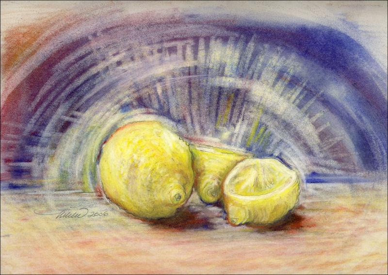
Chrysanthemums, work in progress; see previous post. Above: color details of 85W x 45L inches graphite, colored charcoal / dry pastels on white 100% cotton
When working with a large format, it’s easy to overwork the smaller areas. They’re like little compositions on their own. The trouble is, they may seem successful close up, but may not contribute to the overall balance and flow of the larger piece. Above are some examples, where I’m now reluctant to change what needs to be changed…but I will. Back to Art 101: It’s absolutely necessary to stand back often and study the entire composition from afar.
When you throw in a factor like color, there’s no turning back. I had a specific purpose for this drawing though; to fill a wall space in an otherwise fairly monotone, contemporary room. The idea was to create a look similar to a black and white photo where one color highlights the main subject only.
It’s obvious that introducing color has compromised some of the original spontaneity, so to recapture some of that energy, I carefully try not to disturb what’s left of those livelier marks, and enhance some with little sparks of color. Isolating red, and only red to the central main flower sapped all the attention, so I’ve added more colors to it and the surrounding elements than initially planned.
Categories: Abstract/Realism, charcoal, dry pastels, experimental, flowers, graphite, Seasonal, Spring, work in progress | Comments Off on Adding Color: the point of no return
Comments are closed.