Drawing: there are tones in those tones!
Anyone at any age can begin (or begin again!) to enjoy the drawing experience and learn how to bring the quality of their work to the next level. Pictures help us communicate in a way that words can’t. They are persuasive enough on their own, or can facilitate a thorough understanding of written language. If you have ever played ‘Pictionary’ you know that realism is not required to get your point across. It’s surprising to see how few marks it takes to convey a message, phrase or concept, and how artists might not be any better at it than those who think they can’t draw.
There is a lot of advice available about how-to, and also a lot of contradictory information. Just visit interactive artists’ websites like “wetcanvas!” and read comments in the Critiques forums where artists often disagree on the ‘shoulds’ and should-nots. Some argue fiercely about technical methods with formal terminology insisting they are right, while others assert that there are no ‘should’s at all. Essentially though, these are only guidelines, theories and formulas about what might work. Inevitably the learning that sticks is done through practice, trial and error.
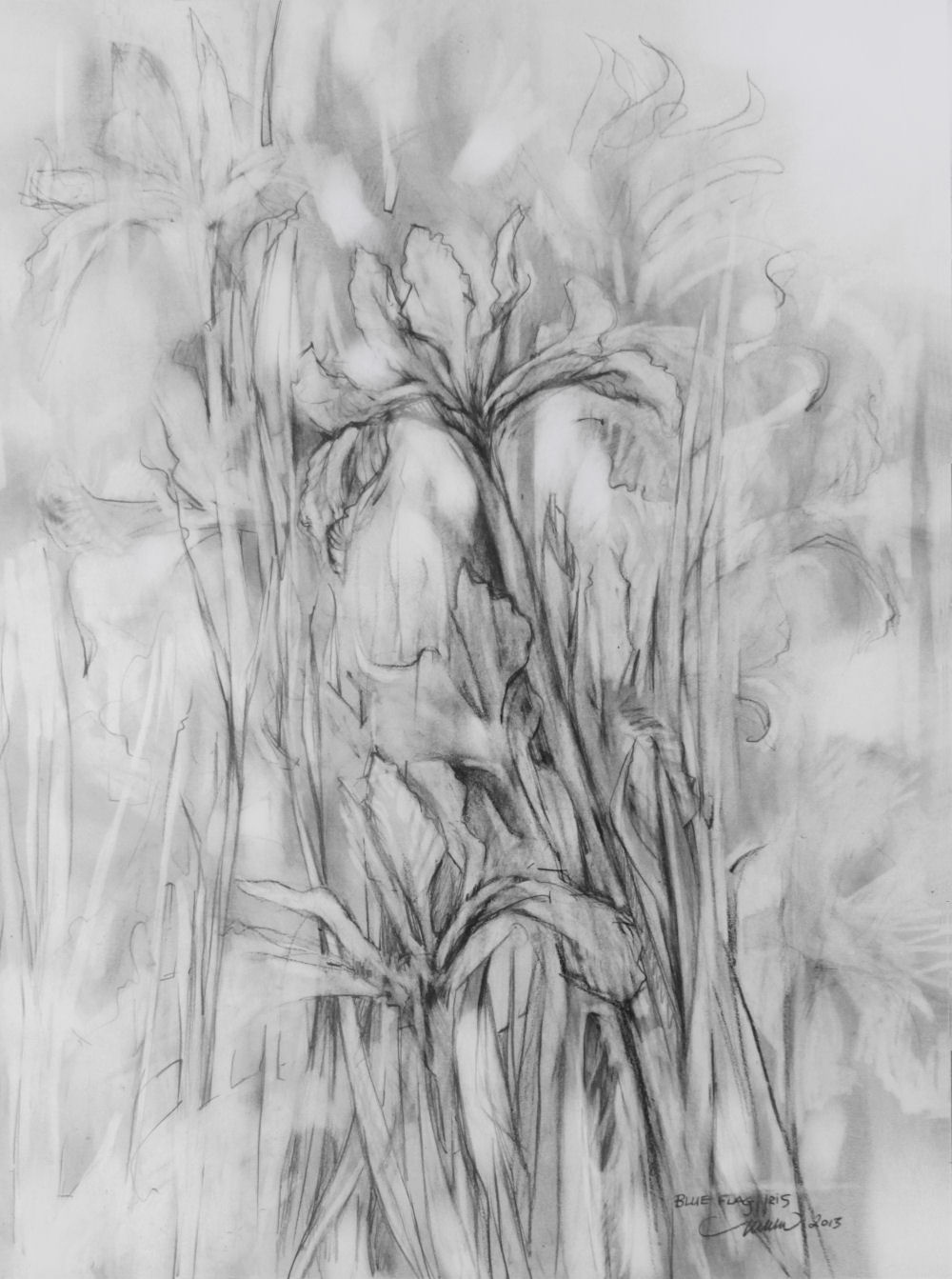 Of course classes, books and the internet provide excellent information and examples, but the best instruction is literally hands-on experience. All theories are best understood when they can be practically applied. Rules make the most sense when they are relevant to something you’re currently working on. But first you have to get started…
Grandma Moses (1860 – 1961) started painting in her seventies. According to Wikipedia, in 2006 one of her paintings sold for 1.2 million. She did not have a great understanding of color, broke all the rules as far as proper composition and the perspective could not be more skewed, but she did not pretend to know much about it anyway. She was direct in sharing her warm memories of rural life, and in that sense she was successful before her paintings earned money. She was not concerned if people liked what she did, she painted what she loved and filled the canvas edge to edge with details. Her legacy is one of inspiration by example that anyone can start anything at any age and that you can paint or draw whatever and however the heck you want! Art is the safest and most effective place for rebellion.
Some of us loved to draw when we were very young, and some who are interested now didn’t, but we are all capable. There is something to be said for innate abilities, but talent alone will not help us advance. You might inherit Grandpa’s artistic genes, but every talent needs continual development to become skill no matter what it is, and drawing is no different than learning to play an instrument or climbing a mountain in that respect. And mountains you will climb…
We are fairly vulnerable when exposing our artwork for others to see. One line reveals a lot. Some people don’t like being watched while working, and some refuse to let their sketchbook pages see the light of day. If you made it with your hands and heart, it’s personal, for sure. In order to progress though, and especially if hoping to sell, at some point it’s necessary to detach the thing from the person who made it. Fearing what others may think, in addition to our own high expectations for perfection can really get in the way in terms of enjoying the process, likewise in the quality of work that’s produced. The other side of the coin is that sensitivity is what helps us to identify with the subject, and this also transfers into the artwork. We need a certain degree of empathy in order to understand what makes things tick in order to replicate them. You’ve got to be open-minded and tenacious at the same time. Each piece has something to teach, and even the fun stuff is not always effortless. I mean, how can converting a three dimensional world into a two dimensional one be easy for anybody?
Art with heart doesn’t always need to be expressed as ‘nice’ or pretty either, for the goal of any system using whatever process is to stir up some kind of response.
The lively feeling that’s transmitted through our work usually occurs during the first stage through quick, automatic sight-to-brain-to-hand responses. Decisions made on the fly and gut reactions are based on observation and experience, not necessarily to success. Practice is required if we hope to improve. Yogis and Zen Masters have students do a lot of mundane chores for years before accepting them to mentor. The premise is that work alone teaches all the secrets, they just have to watch for subtleties everywhere. This also applies to drawing. The promising news is: any time spent drawing is never wasted, even if there is nothing to frame at the end of the day.
Intuition is a genuine source where past studies and memorization involving emotions can be accessed. It is a legitimate 6th sense that involves faith enough to trust your own unique, fairly intangible resources….the subtleties. These strengths contribute as much as concrete traditional rules and regulations because we rely on all of our facilities for production. All are strengths that require practice and fine-tuning.
Intuition also helps us to evaluate when it’s time to stop. Knowing when to quit while you’re ahead can be so much more difficult than continuing to work, but it determines the difference between successful, mediocre, or landfill! So the idea that unknowable sources intervene is not debatable. Heart, brain, or divine, in the end it’s the effort that counts.
Drawing is all about seeking to understand the basic structure of all things; questioning what’s there, and venturing beyond. Drawing is about problem-solving, where we create a situation, assess, and resolve it.
Tidy work space is crucial, because thumbprints and dog-eared paper give a negative first impression, unless they’re intentional of course, but the drawing itself need not be precise. In fact the scribbles that occur in the search for accuracy can be very effective. Revealing marks shares your process and emits another kind of realism by appealing to viewers’ emotions.
One of my favorite approaches to loosening up is to draw a cartoon. Cartoons are about simplification: basic shapes of circles, triangles, squares and so on, eliminating details and exaggerating character. If feeling discouraged about a drawing that is not coming together, start again by breaking everything down to fundamentals. Trying this could have three effects: 1) you will loosen up and not take the work so seriously, which ends up in your favor because before you know it, you are seriously lost in the work. 2) You may become very frustrated, which actually is not such a bad thing because you might return more enthusiastically to what you were working on before trying cartoons 3) You will thoroughly enjoy it and decide that cartoons are your forte! In any case, it helps shake things up a bit when you experiment. Through trial and error you find what you love and discover the methods and styles that work for you.
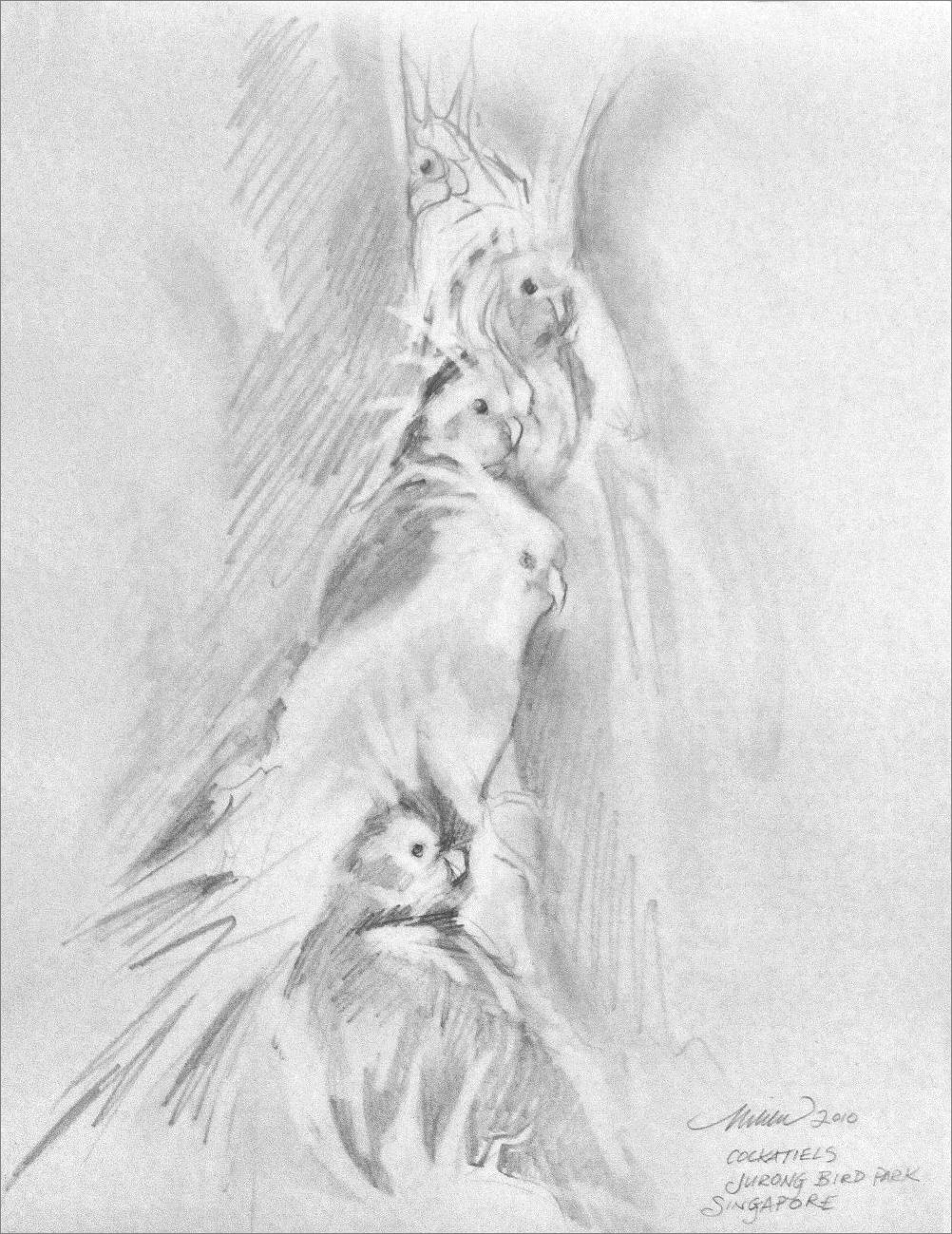 Being aware of all the lines, marks, the shapes, even the spaces is essential — and the fewer you can manage, the better. As already mentioned, illustrations don’t have to be elaborate representations of objects to get the point across. For example, road signs deliberately use uncomplicated pictures to relay traffic messages because ones with words take twice as long to interpret. “All I can do is stick figures”, you say? As a matter of fact, stick figures are an excellent way to begin drawing the human figure, and animals too. Figure drawing courses start with analyzing the Line of Action – the anatomy underneath: the skeleton and musculature. To familiarize students with the figure, one method begins with warm-up exercises are ‘gestures’, quick 30-second / 1 or 2-minute scribbles, working up to longer periods of study. The idea is not to care as much if it is accurate but more about truly attempting to see and only establishing the all-important action.
You sort of have to develop X-ray eyes and see beyond the thing you’re looking at, no matter what it is, in order to portray it well. That stick you just drew could be a backbone. Taking it a step further, the ‘line of action’ extends through the core of the body, indicating the figure’s direction and activity. Determine that, followed by positioning the head, which is just an oval, and angling the stick-arms and legs, and you are well on your way to building the rest of the substance around it.

Once the underlying framework is established, the details fall into place.
!Composition!
Any composition need not be symmetrical, but it does need a sense of harmony. Abstract or representational, a successful work of art captivates the viewer to a prime focal area. From there enough interest keeps vision flowing across the surface then back to the main focus of attention. Lines and marks in the right places are made with sharp tips or soft edges, sometimes predetermined other times not, with heavy hand or light touch, indicating the substance of objects, and implying space. The composition as a whole is attended to from start to finish, and empty spaces where lines or shading are not drawn are to be given as much consideration. Placement of objects within the edges need to make sense, and even off-balance can be used to make a statement, as in abstracts and collages.
Visually, fundamentally, everything is composed of geometric shapes. This is the reason why fruit is the most popular subject to start studying in classes; because the shapes are familiar and reasonably simple. The page, or whatever surface, is instinctively divided into mathematical portions when we look at a picture, and there are ways to play with these portions so that the lead interests are either obvious or subtle, or both. When creating an image using these techniques, artists can 1) visualize what the portions will be, 2) physically mark out light lines across the work, or 3) use an over-lay guide-sheet of clear vellum marked with a grid.
Before putting anything on paper, take a few moments to assess the scene you’re about to draw. Glancing back and forth to the paper (or other substrate), visualize how the largest geometric shapes might be placed. Observation and pre-visualization kick off the process, and you’re already past the blank page if you can see it in your mind’s eye first. If the idea is mapped out this way before beginning, it’s a little easier to guess where and how to start. It’s actually a continual guessing-game adventure. Outlining everything very lightly when starting, large shapes first, then shapes within those shapes, as confidence increases the lines become more self-assured and deliberate. Lighter marks can then be erased, if you decide to erase at all. As mentioned earlier, layering and not removing evidence of the process really adds depth and character. A technique I use is to smudge those built-up marks in certain areas, then use the eraser to create textures and imply soft backgrounds.
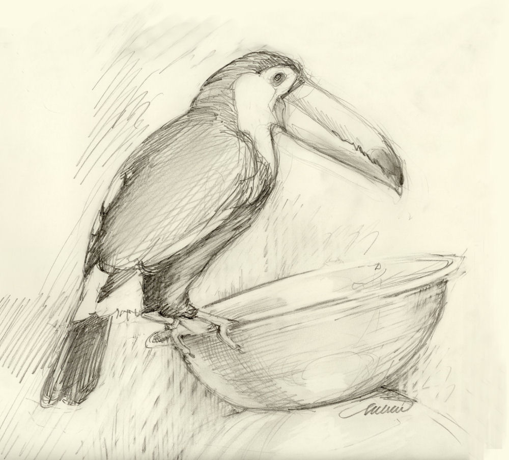 While placing main objects, always watch how they’re fitting in relation to the center, so that nothing ends up over too far on one side of the page. That’s a classic problem. By leaving a couple of inches allowance around the outermost edges of the paper as you work, there will be enough space to make necessary corrections as you go along. Gradually details can be added. Back up from the work every few minutes to get a sense of the overall look and feel of it. It’s also good to start imagining where your signature will be placed. It ought to be blend in with the scene, not be dominant or distract from the main work.
Plan to keep making adjustments to everything until near finishing. This way, one area will not be more detailed than another. It can be discouraging to find that changes need to be made but you’ve just spent a few hours on one area that you now don’t want to touch. If it calls for changing, then it needs to be changed — the other kind of space to keep open is “head space”: one that’s not afraid to make changes that occur as the work progresses! Honesty and the courage to correct are important for a successful finished piece, and also for a well-deserved sense of satisfaction.
Everything in the entire scene ought to be equally considered the whole time while working. It’s common to pay more attention to the solid objects than the surrounding space. The space around the objects is called ‘negative space’. Keeping track of negative spaces, even outlining them as though they are as visible as the solid objects, will do three beneficial things: 1) an interesting composition is easier to maintain when viewed as one complete unit. It’s a little like fitting puzzle pieces together. 2) Noticing negative spaces is an excellent way to judge the proportions of each object in relation to the other, and 3) due to that, they can be used to help correct the perspective. The relationship of positive-negative spaces and background to main subjects reminds me of two comedians on the same stage, where one plays the serious role, setting up jokes so the other can appear as funniest, when in actuality they need and support each other to be fully effective.
The background is also left to refine near finishing, but continually staying aware of it right from the beginning will ensure that it looks and feels like one cohesive piece of work. Save details until the end.
Valuable Values
Values are the shades of grey between absolute dark and pure light. Value and tones have an effect on our deeper impressions. It would seem obvious that all objects must be brightest where light hits, and darkest is on the opposite side of the object, but things can get tricky. You can’t always duplicate exactly what you see. Sometimes in order for the drawing to be convincing, you need to invent the effects and make decisions according to what is happening on the page. The thing in front is only the inspiration. At some point, the art itself guides you to the finish line.
Choose one source of light right from the start, then stick with it throughout the process, even if it’s not exactly like your reference (picture or still life). Decide if the light comes from above, below, from behind, in front, from the left or the right.
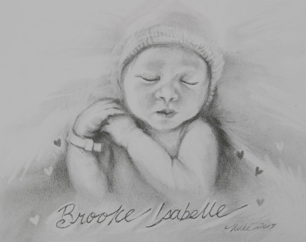
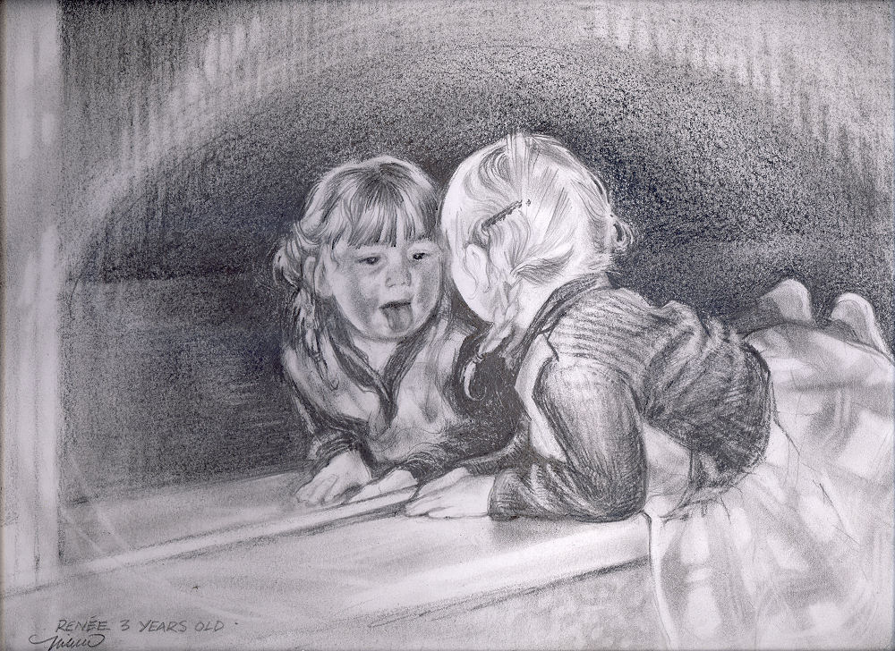
Above left is an example of an illustration where I realized how much is learned through every single thing we try. Sometimes the simplest things turn profound through our experience of them; you know, as more than just writing in someone else’s book. Through the process of this drawing I learned that when we view art we do more than just look, we sense everything, and artists need to do more than just show. I had always thought of values only as the determination of where light was shining, or the absence of it – but character and mannerisms are also imparted through every little corner, even the blank spaces. As far as enticing responses from us, the viewers, grey-scale poses limitations compared to color, so extra thought is called for via subtle cues and techniques used.
Drawings have a job to do: to provide viewers with more than just a pretty picture. When we view art we do more than just look. We sense character, mannerisms, and emotions imparted through every little corner of the work, whether we’re aware of it or not, so within the limitations of gray scale in pencil drawing, artists need to do more than just show. There are tones implied through those tones!
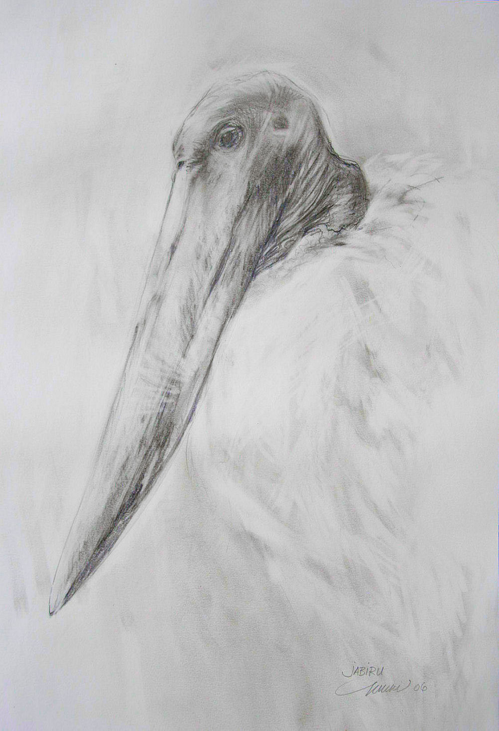 Jabiru are large South American prehistoric-looking birds standing 4-5 ft. high.Reference photos for ‘Jabiru’ were taken at the Dallas World Aquarium, where I’ve spent many visits watching a pair of them interact. Fortunately I can usually study them in silence, because everyone else’s attention is on the flashy coral-colored flamingos just down the isle.
Before starting I envisioned a drawing based on Japanese principles of using fewer lines and shading, with empty spaces considered as much a part of the drawing as every mark.
This is not the prettiest subject, precisely one of the reasons I chose to keep the drawing soft. By purposely compromising the values and using a lighter touch, my hope was that the viewer’s response might be pleasant before thinking “ugly bird”. To explain further, the Jabiru’s feathers are pure white and its head including beak are very dark grey, almost black. I was stubborn about the style staying gentle and simple, having negative space speak as much.
Whereas a photograph utilizes the whole range of dark and light values, copying everything, a person chooses the amount and quality of dark and light values to apply in order to attain the intended the effect on our emotional impressions.
The Jabiru’s huge beak strikes a strong silhouette by shape alone, so to lessen the impact of the large odd shape on a fairly empty page, extremes were avoided even though the bird’s beak is quite dark in reality.
Photographs might be the source of inspiration and for details that memory has missed or forgotten, but a photo is a product of a machine, so the visual details are registered with no emotion. Illustrations that copy exact visual likeness by relying purely on the photo lack a certain warmth no matter how well rendered they are. Art involves the human factor. Art is a subjective representation of all that we sense as well as see.
The beauty of challenge and the grace of mistakes
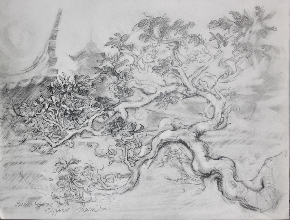
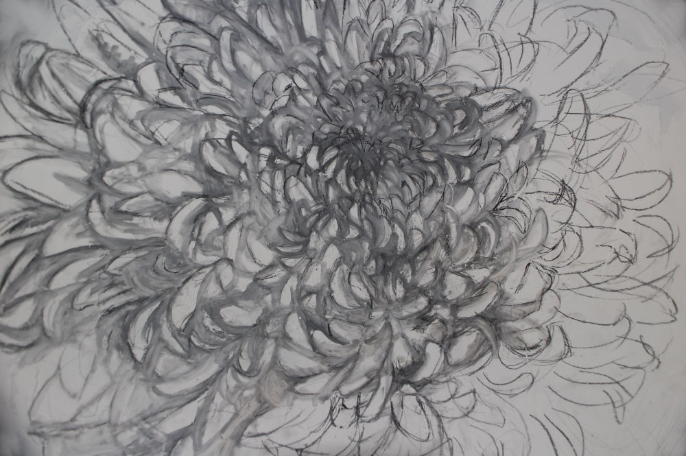 Every new effort is a journey into the unknown. It was a brand new, freshly sharpened pencil that enticed me to try my hand at architecture, not a subject I’m usually comfortable with, but I will follow a nice sharp pencil wherever it wants to go! The world opens up when we invite challenge, but it does occur quite nicely on its own without provocation. Mistakes will happen, so they might as well be put to good use. Determination to recover may 1) force us to try something we might not have otherwise tried, and 2) every attempt at a resolution brings experience. There is nothing better than experience, except maybe 3) triumph. With every attempt to try something that’s difficult, you’re a step or two further than before.
Ironically, it takes a good amount of self-discipline to throw caution to the wind. Risking ruin does more for long term progress than hanging on to an inferior drawing where you know you didn’t try your best.
The topic of photo reference is hot with artists. Personal tastes aside, a photograph can’t compare to the uniquely human thing only we can do: emote through design. We interpret a subject not just visually, but also through our multidimensional senses. The character of your work is a manifestation of you, and has more impact on the viewer than the exact likeness of a subject that any camera could capture. Attempting to replicate an object, express emotions or some other inner vision is exactly like translating one language to another. Copied works can lack a certain liveliness and warmth if too many details are provided.
We are creatures of habit, and once habits form they are difficult to change. For students just starting to learn, I do not recommend relying on a grid system where the picture is marked into even squares, then each square is copied. A grid can be a helpful learning tool for youngsters, but it’s best not to rely on it all the time, and here is why: 1) With the composition sectioned, smaller isolated areas are focused on, which results in distorted proportions. If a lot of time has been spent working on one area, you will be less inclined to change it if it is not accurate. 2) Particularly with portraits, even of someone you are very familiar with, trying to copy exactly from the photo for information will not capture enough on the essence of the real person. Portraits are extremely difficult, because every little nuance in every millimeter makes a difference. Each area relates to the whole picture and so the entire composition should be studied at a distance frequently.
Photos can be excellent source of inspiration. They can be a great reference for accuracy of details that memory has missed or forgotten, but it’s best to make a habit of trusting our own memory and imagination for information. For example, add things that aren’t even there, and make it your own. Whereas photographs utilize the whole range of values and colors in an image, the artist chooses what and how much data would achieve different effects and intentions. You will be pleased with what you are capable of without a picture to rely on. Try to trust yourself and push the envelope a little more each time.
Creative energy is fickle. It cycles, and sometimes seems to disappear entirely. Creativity can be coaxed though, by doing whatever you most enjoy first. Getting started can be the biggest hurdle. Sometimes a break from work, as in any job, is needed. Exhaustion, illness, or life’s events distract attention away from production. It is easy to take for granted how much energy it takes to create. Part of the process is introspective, contemplative, metaphysical, nonrepresentational. During down-times, the absence of product does not mean laziness.
There are so many things that can kick-start motivation if it fizzles. Trying different methods or media helps. Switch from sharp tips on charcoal, conte, or dry pastels to using their sides. Change the dynamic by adding color with colored pencils, pens, markers or oil sticks. Try calligraphy pen and ink with interchangeable tips, and vary types, weights and textured papers. The name “watercolor paper” does not mean it’s off limits for graphite or any other substance, and the same goes for canvas boards or canvas on stretchers; not reserved for painting only.
How about entirely new subject matter, or try some other medium like paint or clay? I find that drawing is very much like sculpting. Sculpting can influence the way you see things the next time you draw. While a pencil imprints on a flat surface, we’re not just duplicating the object, we’re sensing and imagining it as three dimensional form, complete from every perspective, in our minds eye. No kiln to make sculptures? Try polymer clay or paper mache.
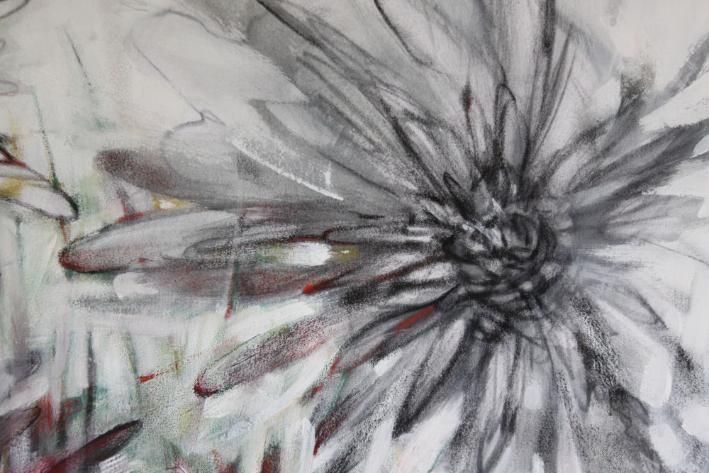 If you’re just getting started, drawing supplies are very inexpensive compared to other hobbies. Basics are available at department stores and craft stores, but the best quality supplies and a greater variety of choices are at art-specific stores. You really don’t need anything more than a dinner serviette and a ballpoint pen or scrap paper and a chewed up old pencil to get started, but in time you will want to up your game and feel the difference quality makes.
Tools for any job make a huge difference, not just in the results but in the efficiency of process from start to finish. Quality materials bring better quality results, which cultivate confidence, which feeds motivation and momentum. The vision you have in mind takes less energy to achieve, and in fact may just pop out on the page before you.
Browsing through books and photos can also reboot enthusiasm. There is nothing like a good old-fashioned book. Visit a book store and flip through some amazing books that you could never afford to buy, or do treat yourself. Second hand stores are a great place to find inexpensive books, then you can buy ten! And finally, it’s amazing what a small inexpensive art supply can do to make you excited about work again. A new set of pencils, markers or pens can do wonders, honestly.
Take advantage of opportunities
Finally, there are so many opportunities now for artists at every level via the internet. Entering exhibitions and online competitions can be fun, help to motivate, and also to find a place for something you’ve already created. If you’re like me, once I’ve finished something it usually just hangs around and piles up. I have no further use for the results of my labors. Art needs to be seen by others to truly find purpose. Entry fees are usually very reasonable, on average around $30 for 2 pieces. Other than that, there’s nothing to loose – they worst they can say is no. Some places offer critiques. Even a ‘no’ is good for experience, reflection and a second look through others’ eyes. Eventually an open-call exhibition will be perfect for something you’ve already created or want to create, and something will be accepted, even win top placement and title or even cash prizes. Regardless, the experience is absolutely positive and enlightening.
Some recommended websites for drawing or anything creative
As I already said, there are a lot of websites offering support, critique and opportunities. Some are free to join and many have free trials with limited time offers or limited image uploading. Most charge an under $100 annual fee to set up a gallery, which is pretty reasonable. I highly recommend the experience of objectively arranging, describing and marketing your work.
The very best site is ArtDeadline https://artdeadline.com/ where there is something for everyone, like postings for internet exhibitions, group-gallery exhibitions, competitions, call for submissions (portfolio for solo exhibitions), jobs, festivals, public art, grants, fellowships, internships and residencies. There are forums and everything you ever want to know about self-promotion, advice and professional representation.
Associated with it is Artist2Artist at http://artdeadline.ning.com/ There is a great community if you like sharing and seeing others’ work, a free limited online gallery offer, and the online curator is amazing with her knowledgeable and spot-on critiques.
Another good site offering a free online gallery is Artavita at https://www.artavita.com/
WetCanvas! at http://www.wetcanvas.com/ is a HUGE website. Join, participate in discussions or just browse. There is nothing that is doesn’t offer, with so many forums and so much information. Good luck and have fun!


