
abstract
« Previous EntriesCam’s crab shell
Tuesday, February 6th, 2024

Who sees a crab shell on the beach and thinks, “I wanna paint that thing!”? … my 12-year-old grandson. We took him to see the Pacific Ocean for the first time when he visited us during Thanksgiving last year. He also gathered a lot of shells to create a video of smashing. When I go to the beach, my imagination only ventures as far as how pretty it would be as a pastels-on-paper seascape, but true creativity knows no bounds. I love it!
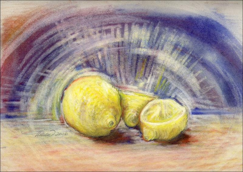
Microbial Diversity 02
Friday, October 14th, 2022

Microbial Diversity 02, 18H x 24W inches soft pastels on paper
Day Lilies
Saturday, July 10th, 2021

Day Lilies, 18H x 24W inches soft pastels on paper. After 5 days of chasing an unsuccessful forest piece, I ripped it up, broke free of the frustration and had some fun with a new subject, colors and a completely different style. Art: no rules! This is my answer to “if you’re not enjoying it, why are you still working on it?”
Pacific NW Winter Palette
Wednesday, February 24th, 2021

Pacific NW Winter Palette, 18H x 24W inches soft pastels on 90 lb watercolor paper
Landscapes of the Mind
Sunday, December 6th, 2020

Two pieces will be showing at the Landscapes of the Mind exhibition at the First Floor Gallery, Santa Clarita city hall December 2020 through March 19, 2021. Here is the link to the virtual exhibition (work shown is not to scale). My two pieces, The Campsite and Winter Forest: Dogwood, both watercolors, are located just to the right as you enter, behind the central walls.
Abstracts online exhibition
Friday, December 4th, 2020

The Sound of Silence – 2009, 36H x 24W x 2D acrylics on canvas, trim frame
Five pieces were accepted into the J. Mane Gallery online exhibition Abstracts 2020 showing through December. All are available for sale, listed on the left sidebar.

Birch – 2012, 12H x 16W inches watercolors and Multnomah Falls – 2017, 18 x 24 inches watercolors

Queen Anne’s Lace – 2018, 14H x 20W watercolors and Spring Garden Mix – 2013, 18H x 24 oil pastels
Summer Garden Abstract
Monday, January 20th, 2020

Summer Garden Abstract, 14H x 20W inches watercolors on 140 cold pressed. Resist medium was used to create abstract, flowering negative spaces.
Forest Abstract: Winter Spirit
Saturday, January 18th, 2020

Forest Abstract: Winter Spirit, 12H x 14W inches limited palette watercolors on 140 lb cold pressed.
Artavita Contest finalist
Saturday, June 1st, 2019

 This piece was a finalist in the Artavita competition for the front and back covers of the International Contemporary Masters Volume 13, June 2019.
Winter Forest: Dogwood, 14H x 20W inches watercolors on 140 lb cold pressed, 21H x 26″ framed size. In the beautiful, organized chaos of a winter forest in Pacific Northwest, rain brings out the subtleties, in particular the red branches of wild Dogwood complimented by the surreal green colors of moss on every tree.
Queen Anne’s Lace, watercolors
Friday, August 10th, 2018

Queen Anne’s Lace, 14H x 20W inches watercolors on paper
« Previous Entries